The lonely ottoman sitting obtrusively in the hallway, the art-deco owl eked onto the crowded mantelpiece, the garish rug shouting into the living room; all symptoms screaming for a minimal makeover.
is streamlined. A clearly defined space needs no additions, meaning less expenditure.
Minimalism doesn’t simply mean less things. Clashing colours, discordant features and clumsy lighting can all contribute to chaos. These tips can transform your home from cluttered to composed:
Ask yourself what you need.
Purging may seem daunting, but it’s the basis for minimalist living. Think simply, and letting go of dust-gatherers can be quick and painless.
Focus on function: Is it useful? The room’s features should work for you. This doesn’t mean survival-mode, there’s room for aesthetic function here; keep decorations conducive to your theme. But if it’s neither practical, nor stylish, get rid of it.
Beautiful or useful? A feature can accommodate both. An ornate chest serves as a coffee table, a bowl houses keys and a lamp breathes open space.

http://homesteadhealer.com/coffee-table/coffee-table-trunks.html
There’s even room for the new. But try the “one in, one out” rule. With every new purchase, out goes an existing feature.
Now take control of the room’s feel
Focus on colour, shape, and balance. Stripped back, the room’s features should complement one and other.
Earth Tones: Go neutral and keep it subdued: beige, brown and grey. The basics feel crisp, clear and calming; limit the palette to two or three colours.
Clean lines and flat surfaces: Focus on clean, defined lines. Use rectangular shapes, with sharp, rounded edges, arranged symmetrically. Ornate antiques such as jagged picture frames, elaborate sculptures and ostentatious trinkets can disrupt each other.

http://www.livspace.com/magazine/decor-secrets-minimalist-style/
Weight the room: With minimal features, it’s important to consider the room’s content even more carefully. Distribute its features evenly and consider its focus. For instance, the living room may be centred on the coffee table, try to accentuate that by arranging tables around it and avoid overfilling other areas.
Off-set the whole thing with subtle short-cuts
A de-cluttered and toned-down approach can leave a room looking monotone and its features stark.
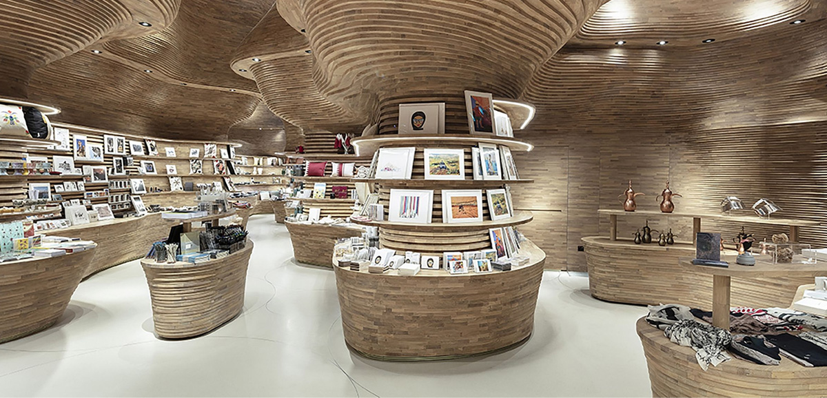
Texture over colour From wood to wool, texturing adds variety. Knitted curtains, beaded pillows and faux fur rugs contribute character. Their comfort and sensory appeal breathes a little life into an anonymous space.

Texture paint designs for hall entry eclectic with wall lighting wood trim wood paneling
http://www.czmcam.org/24960-texture-paint-designs-for-hall-bedroom-transitional-with-window-treatments-upholstered-headboard-wall-art/texture-paint-designs-for-hall-entry-eclectic-with-wood-trim-ceiling-lighting-wood-flooring-4/
The power of patterns: Try a wall hanging or a detailed rug for a little vibrancy. But keep it simple, thematic and preferably geometric.
Ornamentation: Don’t go overboard. Your decorative elements should complement one and other. In terms of shapes and styles, choose a theme. Elaborate features can work, but make an ensemble of them. For example, a plant might mimic a painting.
Make use of light: Natural light will suit those basic, foundational tones, and mirrors serve to augment this. Leave windows bare, whilst white walls can reflect and diffuse.
Now you’ve seen that the ethos is not only identifiable in the latest minimalist décor trends, but in the daily habits of a healthy lifestyle. If the keys – wallet – phone routine involves piling through papers, prising apart pillows and rifling through pockets, then simplicity is the solution.
Written by: Alex Glendinning
 About the author: Alex Glendinning is a freelance writer with an BA in English and History from the University of Sussex. From P.R. to journalism his work has featured in The Gulf Times and Qatar Today. Read more at clippings.me/sympa and https://innerouterblog.wordpress.com/


Leave A Comment
You must be logged in to post a comment.